Blendmode or PorterDuff Mode - Multiply
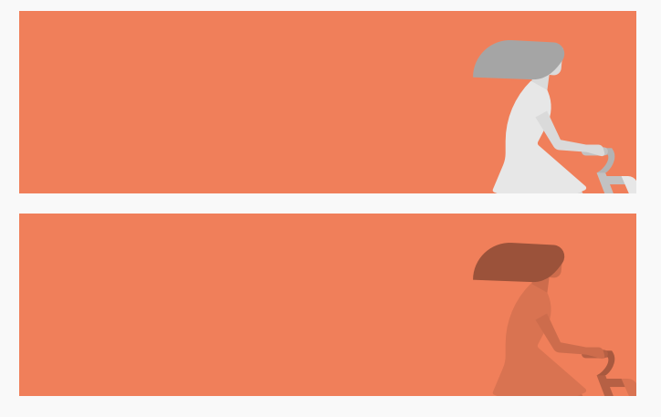
— 04 Jul, 2020Recently, our designers were pondering about exporting an image from Sketch with applied blending mode. We tried to export the image with Multiply blending mode, but to our surprise, the effect was not visible in the apps. First image is without blending mode, second image is with Multiply blending mode.
Then we reach out to Sketch, and received following pointers:
You have correctly set up the image in Sketch, to have a Multiply blending mode, but note that blending modes will only have an effect in the environment in which that blend mode is applied. If you want to have a Multiply blending mode wherever you use the image in the development/coding environment, then you need to set that up in the development/coding environment and each programming setup would work from any application.
Blending mode in CSS world:
Blending mode is translated as PorterDuff mode in Android:
https://developer.android.com/reference/android/graphics/PorterDuff.Mode
There are many articles on PorterDuff, but it still quite amaze many developers when working with API. For example, here's is one such excellent article with illustrations on PorterDuff modes:
http://ssp.impulsetrain.com/porterduff.html
PorterDuff is a technique of compositing digital images. The default Android way of composing images is PorterDuff.Mode.SRC_OVER, i.e draw the source image/color over the target image/color.
After exploring Android SDK, PorterDuffXfermode(PorterDuff.Mode.MULTIPLY) was a perfect candidate to blend the images. To create the desired effect, we developed a custom view which will have an overlay bitmap illustration blended as PorterDuff.Mode.MULTIPLY.
To have a custom view with illustrations as an overlay, we need Paint for different objectives.
// paint for a custom view
private val backgroundPaint = Paint().apply {
  flags = ANTI_ALIAS_FLAG
}

// paint for an overlay illustration mask with PorterDuff mode MULTIPLY
private val overlayMaskPaint = Paint().apply {
  flags = ANTI_ALIAS_FLAG
  xfermode = PorterDuffXfermode(PorterDuff.Mode.MULTIPLY)
}

// paint to blend bitmap with the background canvas
private val overlayBackgroundPaint = Paint().apply {
  flags = ANTI_ALIAS_FLAG
}
We also need objects for handling original and processed bitmaps.
// original source image
private var overlayBitmapSrc: Bitmap? = null

// final bitmap of an overlay illustration with PorterDuff mode MULTIPLY effect
private var overlayBitmap: Bitmap? = null
Custom views can be of different shapes, either you can create a rectangle view or may be a round corner view with side cuts. Path is the most flexible way to create your desired custom view.
// Path for custom view drawing as per requirement - could be rectable or custom shape
private val viewPath = Path()

// Path for the bounds of overlay illustration with PorterDuff mode MULTIPLY
private val illustrationPath = Path()
To initialize properties, parse XML attributes to read default properties.
init {
  // assuming you will parse XML via attrs and get backgroundColor
  // val typedArray = context.obtainStyledAttributes(attrs, R.styleable.CustomView)

  // Set background color of custom view
  backgroundPaint.color = backgroundColor
  // Set color of an overlay illustration background
  overlayBackgroundPaint.color = backgroundColor
}
After initialization, it's time to do the heavy lifting by computing the path, evaluating the desired bitmap and drawing it over canvas. Make sure not to allocate resources in the onDraw() call.
override fun onDraw(canvas: Canvas) {
  super.onDraw(canvas)

  // Step 1: Compute path as per bounds
  computeViewPath()

  // Step 2: Draw the path as custom view with a paint
  canvas.drawPath(viewPath, backgroundPaint)

  // Step 3: Compute overlay bitmap bounds,
  // apply PorterDuff mode MULTIPLY and make sure to evaluate padding
  computeOverlayBitmap()

  // Step 4: Draw the bitmap of an overlay illustration with PorterDuff mode MULTIPLY
  overlayBitmap?.run { canvas.drawBitmap(this, 0f, 0f, null) }
}
For this custom view, we will keep it simple and create a rectangle custom view.
private fun computeViewPath() {
  // make sure to reset path, start as clean slate
  viewPath.reset()

  val left = 0f
  val top = 0f
  val right = width.toFloat()
  val bottom = height.toFloat()

  // create path from left and top corner of the view
  viewPath.moveTo(left, top)
  viewPath.lineTo(right, top)
  viewPath.lineTo(right, bottom)
  viewPath.lineTo(left, bottom)

  // make sure to close the path at the end
  viewPath.close()
}
Let's look into the core computeOverlayBitmap(), which prompts for an article. To draw an illustration as an overlay, we need to look into following
points :
->> Compute the desired size of the bitmap - don't forget to evaluate the padding
->> Scale the illustration image - either as height or width
->> Create the bitmap as per desired height and width, create a canvas instance pointing to the created bitmap. After drawing upon the bitmap with the Canvas, then carry Bitmap to another Canvas. Finally, the bitmap with canvas should be drawn via onDraw().
private fun computeOverlayBitmap() {
  illustrationPath.reset()

  val viewHeight = height - paddingBottom - paddingTop
  val viewWidth = width - paddingEnd - paddingStart

  overlayBitmap = overlayBitmapSrc?.let { bitmap ->

    val inHeight = bitmap.height.toFloat()
    val inWidth = bitmap.width.toFloat()

    // get height ratio between view height and bitmap height
    val heightRatio = viewHeight / inHeight
    // get width ratio between view width and bitmap width
    val widthRatio = viewWidth / inWidth

    // take smallest ratio between height ratio and width ratio to scale within bounds
    val aspectRatio = if (heightRatio > widthRatio) widthRatio else heightRatio

    // get scaled width and height as per aspect ratio
    val scaledHeight = (inHeight * aspectRatio).toInt()
    val scaledWidth = (inWidth * aspectRatio).toInt()

    // create overlay rect bounds to draw bitmap illustration
    val overlayRect = Rect(
      viewWidth - scaledWidth + paddingStart,
      viewHeight - scaledHeight + paddingTop,
      width - paddingEnd,
      height - paddingBottom
    )

    // compute path bounds
    val pathLeft = overlayRect.left.toFloat()
    val pathRight = overlayRect.right.toFloat()
    val pathTop = overlayRect.top.toFloat()
    val pathBottom = overlayRect.bottom.toFloat()

    // create illustration path
    illustrationPath.moveTo(pathLeft, pathTop)
    illustrationPath.lineTo(pathRight, pathTop)
    illustrationPath.lineTo(pathRight, pathBottom)
    illustrationPath.lineTo(pathLeft, pathBottom)
    illustrationPath.close()

    // Create a bitmap with required height and width
    val result = Bitmap.createBitmap(right, bottom, Bitmap.Config.ARGB_8888)
    // Create a canvas instance pointing to the created bitmap
    // After drawing upon bitmap with the Canvas, then carry Bitmap to another Canvas,
    // finally, the bitmap should be drawn via onDraw()
    val tempCanvas = Canvas(result)
    tempCanvas.drawPath(illustrationPath, overlayBackgroundPaint)
    // tempCanvas.drawPath(illustrationPath, overlayStrokePaint) // added to show the bounds of illustration
    tempCanvas.drawBitmap(bitmap, null, overlayRect, overlayMaskPaint) // PorterDuff.Mode.MULTIPLY
    return@let result
  }
}
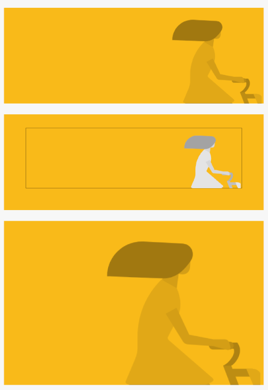
There are three different cases, first one is the usual size view, second one is a custom view with padding, and third one is a large size custom view. The black stroke represents the bounding box of the illustration image. Keep in mind, we have scaled the image as per height or width, whichever is smaller.
Let's look at the normal scenario, where an overlay illustration is drawn at the bottom of a custom view with PorterDuff mode MULTIPLY.
<CustomView
  android:layout_width="match_parent"
  android:layout_height="140dp"
  app:backgroundColor="@color/solid_yellow"
  app:blendOff="true"
  app:overlayImage="@drawable/ds_illustration_bike" />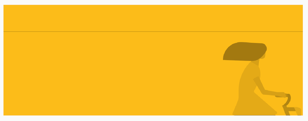
In the second case, we have accounted for padding in an overlay illustration on the custom view. Also, PorterDuff is off from an overlay illustration. As you can see, if we account for padding, the illustration is not as elegant as the first case.
<CustomView
  android:layout_width="match_parent"
  android:layout_height="140dp"
  android:padding="32dp"
  app:backgroundColor="@color/solid_yellow"
  app:blendOff="false"
  app:overlayImage="@drawable/ds_illustration_bike" />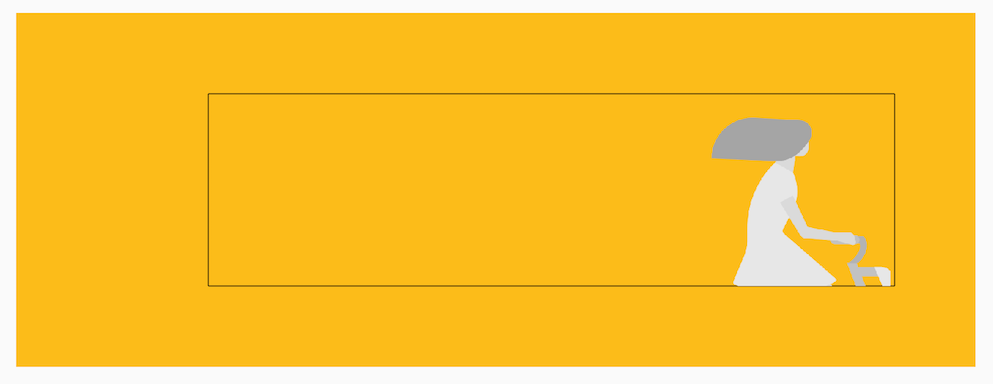
The third case is similar to first one, with one difference - the height of the view is bigger to see the scaling effect.
<CustomView
  android:layout_width="match_parent"
  android:layout_height="240dp"
  app:backgroundColor="@color/solid_yellow"
  app:blendOff="true"
  app:overlayImage="@drawable/ds_illustration_bike" />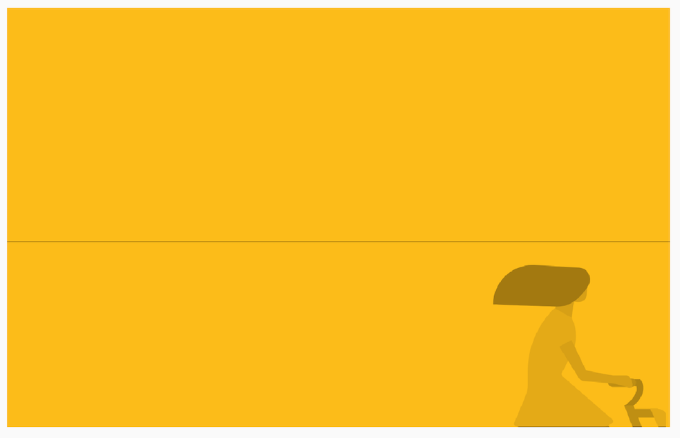
Depending upon design needs, we can customize the scale effect. For eg, to have a scaled illustration, just flip the aspect ratio as per height ratio.
val aspectRatio = if (heightRatio > widthRatio) heightRatio else widthRatioAfter scaling as per height, the bounding box for an illustration is the same as the height of the custom view.
For your project, if you are looking for adding an overlay illustration to your view, try out PorterDuff Mode. PorterDuff Mode has many applications and creates an impression of one view.